
A social media focused polling platform, requiring full branding and user interface design, working alongside our development partners across mobile and tablet during the development process.

We were approach by Sock!t, a start up social media polling platform to undertake the initial branding of the company, to include a series of multi-use logo's, both static and animated to use across the various social media channels. We initially created the initial word mark for the logo, using an approachable sans-serif font, whilst incorporating a subtle vertical flip of the letter 'i' to form an exclamation mark. We further developed the logo to include the colour ways devised during the mobile app and tablet visual design, whilst also widening the logo set to include favicons and avatars.

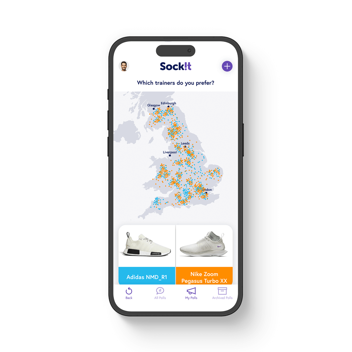


Once the logo design and branding was well underway, we began the initial wireframing for the mobile app. As a startup company, with an initial idea but requiring a high level of input from Pendulum to devise the user interface, we spent a great deal of time with Sock!t devising the key functionality and user experience. Through many iterations of wireframes, we ultimately created a refined app framework on which to build the visual design of app.


Alongside the mobile app design, we also worked on the required adaptations to ensure an intuitive user experience across tablet displays. We followed operating system recommendations for navigation placement and on screen asset sizing and spacing to ensure familiar functionality for users.